Topographic maps are one of the most reliable navigation tools you can carry, and they’re the one I trust most. They show the shape of the land, the height of hills and valleys, the location of tracks and waterways, and most of what you’ll actually encounter on the ground. Unlike apps or GPS devices, a paper map doesn’t rely on batteries or reception. Once you know how to read one properly, it lets you visualise the landscape before you arrive, plan a realistic route, and make safer decisions when conditions change.
This article sits within the Navigation and Positioning system. A map is only one component of that system, but it’s the foundation everything else builds on: understanding terrain, confirming location, and stopping small navigation errors from escalating.
This guide is about map literacy rather than compass mechanics. My aim is to help you understand what the map is actually telling you about the terrain, so you can apply that anywhere in Australia, on track or off it.
What a topographic map actually represents
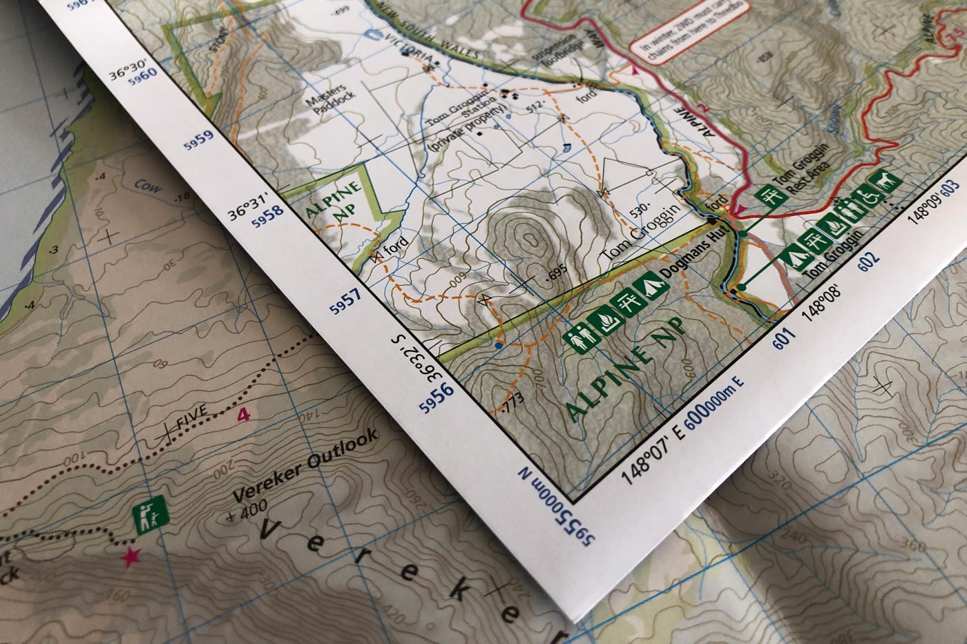
A topographic map is a scaled, symbolic representation of the landscape viewed from above. Every line, colour, and symbol on it is there to communicate something specific about the ground beneath your feet. It doesn’t show what the land looks like in a photographic sense. Instead, it shows shape, height, distance, and key features in a consistent, measurable way.
The most important thing to understand early is that the map isn’t a suggestion or an illustration. It’s a measurement tool. Once you can read it accurately, you can judge distance, steepness, and route options long before you commit to any of them.
Understanding map scale and distance
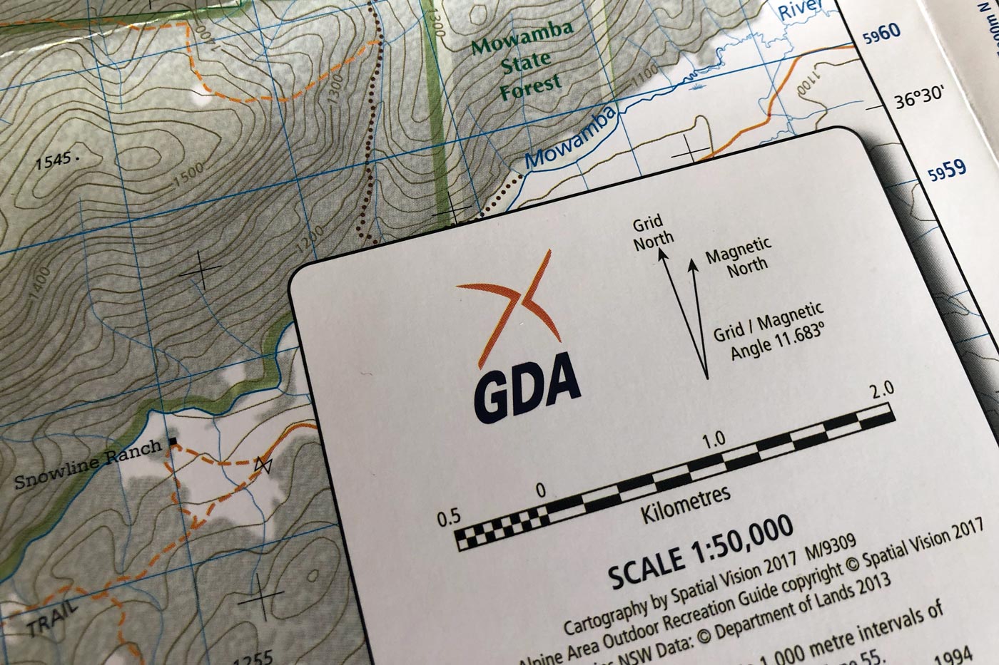
Map scale tells you how much the real world has been reduced to fit on the page. In Australia, hiking maps are most commonly produced at scales such as 1:25,000 or 1:50,000. A scale of 1:25,000 means that one unit on the map represents 25,000 of the same units on the ground. One centimetre on the map equals 250 metres in reality.
Scale matters because it determines how much detail you can see and how accurately you can measure distance. Larger scale maps, such as 1:25,000, show more detail and suit off-track travel, complex terrain, or dense bush better. Smaller scale maps, such as 1:50,000, cover a wider area but with less fine detail.
Distance alone doesn’t tell you effort, though. Two routes that measure exactly the same length on the map can feel completely different on the ground depending on gradient, terrain, and vegetation, which is why scale only gives you half the picture. Read it alongside the contours if you want to judge how hard a route is actually going to be.
Contour lines and how they describe terrain
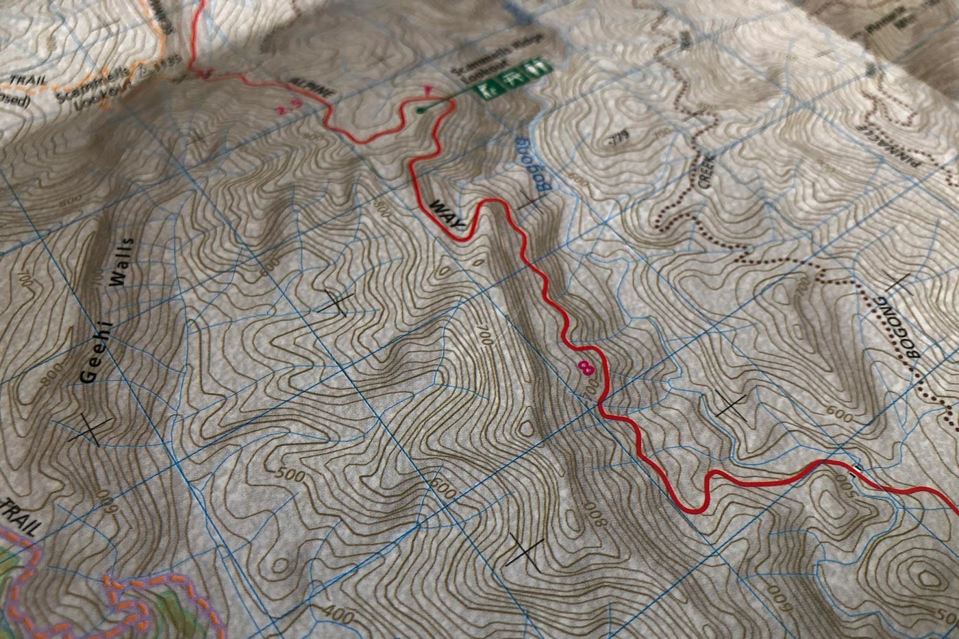
Contour lines are the foundation of topographic map reading. Each one connects points of equal elevation above sea level, so in Australia, where elevation is measured in metres, the contour interval tells you the vertical distance between adjacent lines. Most Australian hiking maps use intervals of 10 or 20 metres, meaning each line you cross represents a rise or fall of that amount, and the exact interval for the map in your hands is always stated in the legend, so check it before you rely on it.
What the spacing of those lines tells you is slope. Closely spaced contours mean steep terrain, widely spaced contours mean gentler slopes or flatter ground, and you can read that straight off the page without calculating a single height, which is enough to tell you where the hard climbing or the steep descents are going to be.
That’s as far as I’ll take contours here, because reading the shapes they form into actual landforms, hills, spurs, ridges, gullies, saddles, is a skill in its own right and deserves more room than a section on map literacy can give it. Understanding topographic features for hiking covers that in depth, and it’s worth working through once you’ve got scale and elevation settled. What matters at this stage is remembering that a contour line is a measurement, not a path or an obstacle. Treat it as either of those and you’ll misjudge how a slope is actually going to feel underfoot.
Height, elevation, and relative relief
The elevation numbers printed on the map show height above sea level at specific points. Useful, but for hiking, relative relief usually matters more: the difference in height between where you are and where you’re going.
A summit at 900 metres might sound modest, but if you’re starting from 100 metres, that’s a significant climb. Walking a ridge that stays within a narrow elevation range, on the other hand, can be far less demanding even at higher absolute heights.
Elevation also feeds into how I read the weather and the terrain around me. Higher ground in Australia is often more exposed to wind and weather changes. Valleys can funnel cold air, trap fog, or hold water after rain. Reading the map lets you anticipate that rather than discover it the hard way.
Grid systems and map orientation
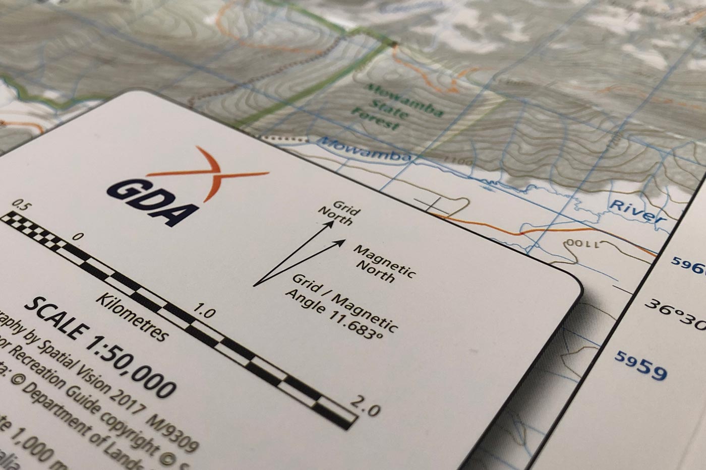
Australian topographic maps use a grid system for accurate position reference and measurement. Most modern maps are based on the Map Grid of Australia, aligned to a metric grid. Grid lines are usually printed as eastings and northings, spaced at regular intervals, often one kilometre apart.
The grid isn’t decoration. It lets you estimate distances, describe locations precisely, and relate your position to other navigation tools. Even without a compass in hand, understanding the grid keeps your sense of direction and scale consistent.
Grid north isn’t the same as true north or magnetic north, and it’s easy to mix them up without noticing. For map reading, grid north is usually all you need, particularly for route planning and terrain interpretation, but the key is consistency: pick one reference system and stick with it through your planning and navigation rather than switching between them casually.
Map symbols, colours, and what they tell you
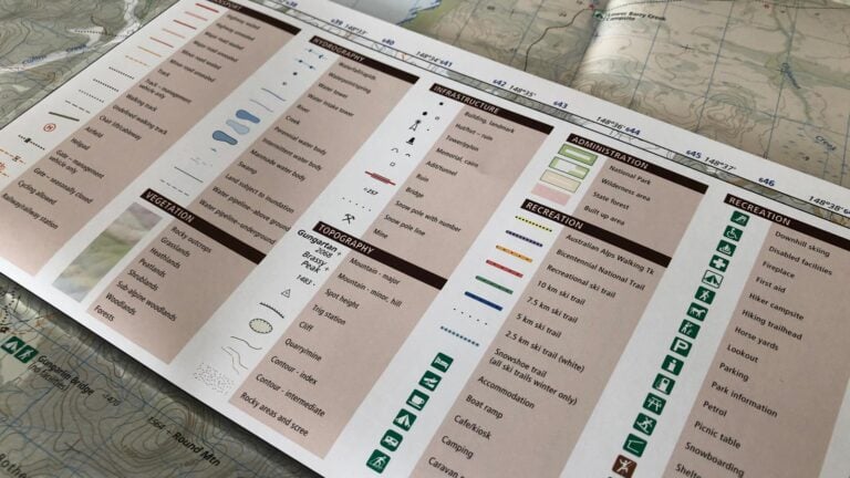
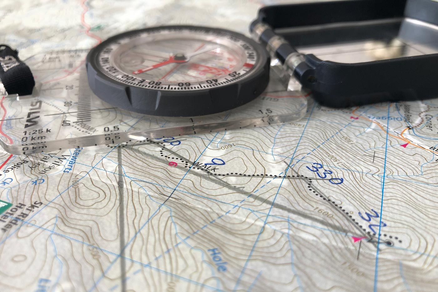
Topographic maps use standard symbols and colours for features on the ground: tracks, roads, buildings, fences, waterways, vegetation boundaries, and land management features. Learning these isn’t about memorisation for its own sake. It’s about understanding how human and natural features interact with the terrain.
Blue features usually mean water, rivers, creeks, lakes, or swamps. In Australia these can be seasonal, so a blue line doesn’t guarantee flowing water year-round, and the map doesn’t show current conditions. I use water features as navigational references, but I never assume they’ll provide reliable water without confirming it on the ground.
Brown lines and shading represent contours and earth features. Black symbols usually mark constructed features like tracks, bridges, or buildings. Green shading can indicate vegetation, but density and walkability vary widely across regions and aren’t always shown in detail.
I’ve learned not to over-trust a track just because it’s shown on the map. Some are faint, overgrown, rerouted, or no longer maintained, because the map shows that a track exists or existed, not what condition it’s in today. That’s why I use terrain features alongside the track itself to confirm where I actually am, rather than trusting the line on the page on its own.
Visualising the landscape from the map
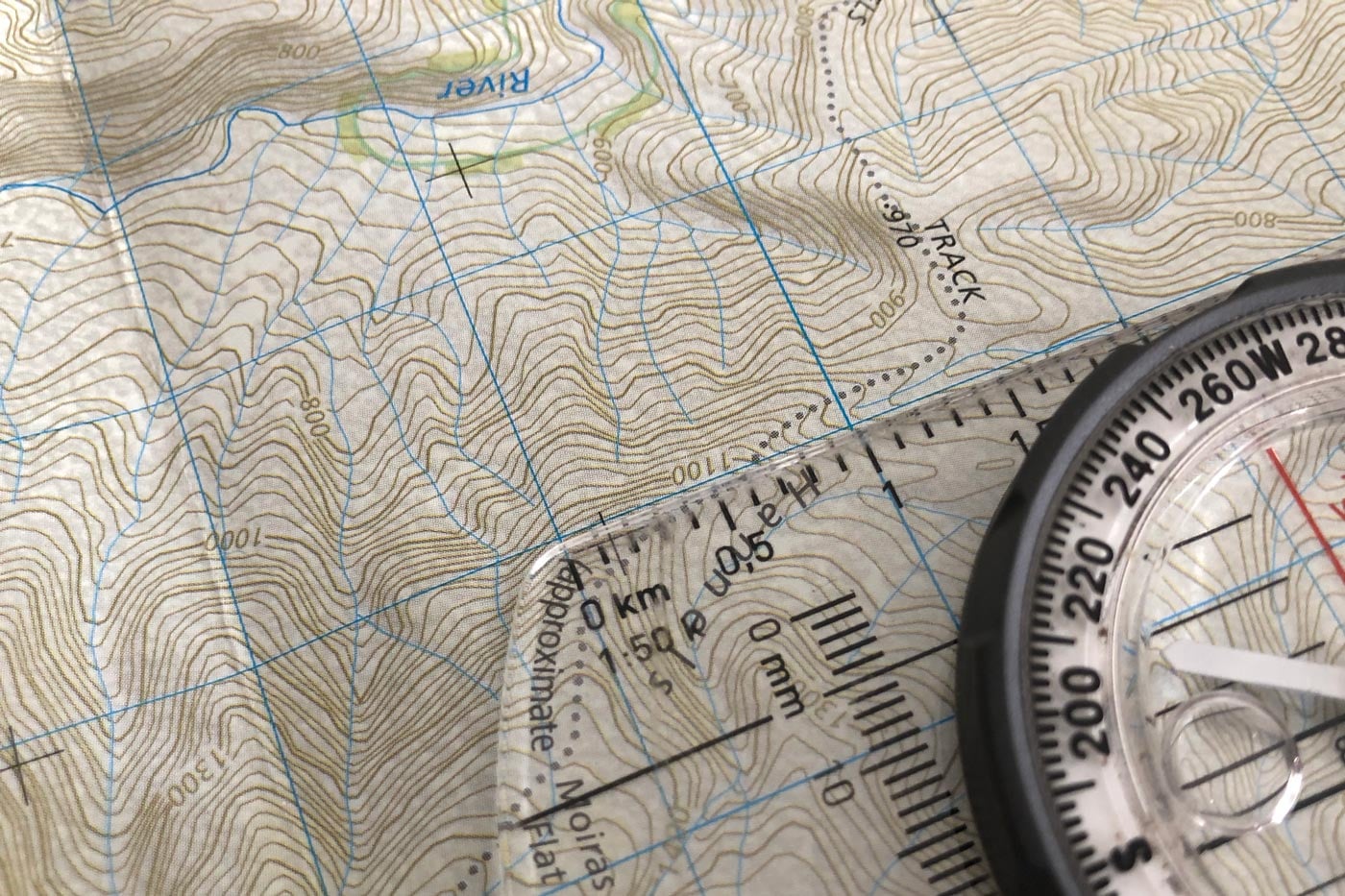
Good map reading comes down to mental visualisation: being able to imagine the shape of the land from the contour patterns before you actually step onto it. It’s a skill that improves your route choice, your pacing, and your confidence.
When I’m planning a route, I trace it with a finger and note where the contours tighten or spread out. I pick out ridgelines, saddles, spurs, and valleys along the way, and think about where the climbs are sustained versus short and steep, and where the terrain might slow me down or offer easier travel.
That process cuts out a lot of surprises. It also gives you options: if the weather turns or daylight runs short, you’re better placed to spot an escape route, lower ground, or a safer alternative, because you already understand the shape of the country you’re standing in.
Using maps for route planning and decision making
Topographic maps support decisions long before and during a hike. During planning, they help you judge whether a route suits your fitness, experience, and the time you’ve got. On the ground, they help you confirm progress and adjust the plan when you need to.
Using a map well means constantly comparing what you see around you with what the map predicts: ridge here, creek there, slope rising or falling as expected. When the map and the terrain agree, your confidence grows. When they don’t, that’s a signal to slow down and reassess rather than push on regardless.
The thing that actually gets people into trouble is continuing forward despite feeling uncertain. Maps are most valuable at exactly the moment they prompt you to stop, check, and think rather than hope the discrepancy resolves itself, because that pause is usually what stops a small error turning into a serious one.
Australian-specific considerations
Australian terrain throws up its own challenges for map readers. Vegetation density can obscure landmarks. Creeks can be dry for much of the year. Fire trails and management tracks appear and disappear over time. Distances can feel longer than they measure, thanks to heat, rough ground, or scrub.
Maps also vary in age and source, so I always check the publication date and keep in mind that land management practices, fires, and erosion can all change conditions on the ground since the map was made. I treat the map as a framework, not a promise.
Map reading is a skill built through practice more than anything else. Start on familiar walks, compare what you see with what the map shows, and over time interpreting contours and symbols becomes close to instinctive. The map stops being something you consult occasionally and becomes something you actively read as you move.
Building confidence through practice
Map reading isn’t an abstract or academic skill. It’s a practical tool that improves safety, efficiency, and enjoyment in the bush, and the more often you use a topographic map, the quicker you recognise terrain patterns and anticipate what’s ahead.
Confidence comes from repetition and verification. Every time the map correctly predicts the land, your trust in your own interpretation grows, and that’s what lets you make clearer decisions, travel more responsibly, and handle the unexpected with a wider margin for safety.
A topographic map doesn’t just tell you where you are. It tells you where you’re going and what it’s going to take to get there.